
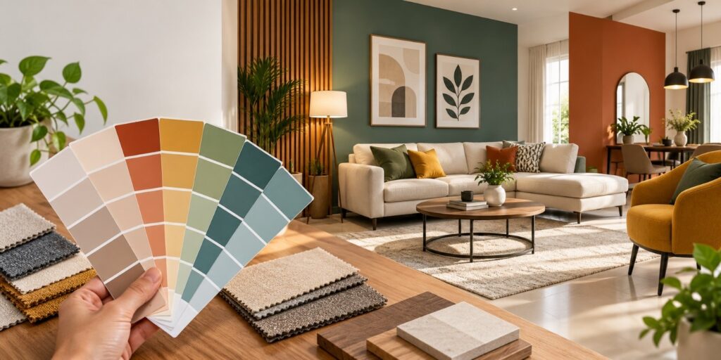
Choosing the right colours is one of the most important decisions when designing a home. The right shade can make a room feel spacious, warm, calm, elegant, or lively, while the wrong combination can make even a well-designed space feel uncomfortable. Whether you are planning a new home or renovating an existing one, understanding how colours work together can help you create interiors that look beautiful and feel right for everyday living.
For homeowners looking for Home Interior in Chennai, colour selection should also consider the local climate, natural light, room size, and lifestyle. Chennai homes often receive plenty of natural sunlight, so choosing shades that work well with the available light can make a noticeable difference.
Understand the Purpose of Each Room
Before selecting a colour, think about how the room will be used. Different spaces create different moods, so one colour scheme may not work throughout the entire home.
For living rooms, neutral shades such as beige, cream, warm grey, or soft white can create an inviting atmosphere. You can add character through furniture, curtains, cushions, artwork, or an accent wall.
Bedrooms generally benefit from calming shades. Soft blue, sage green, lavender, beige, and muted earthy tones can create a relaxing environment. For children’s bedrooms, brighter colours can be introduced through selected walls or decorative elements without making the room feel overwhelming.
Kitchens can work well with clean whites, warm neutrals, greens, blues, or subtle wood tones. The colour should complement the cabinets, countertops, backsplash, and flooring.
Consider Natural and Artificial Lighting
Lighting can significantly change how a colour appears. A shade that looks perfect in a showroom may look completely different in your home.
Rooms with plenty of natural sunlight can accommodate deeper or cooler shades. Darker colours can add depth and sophistication when balanced with sufficient lighting. Rooms with limited natural light usually benefit from lighter shades that reflect more light and make the space feel brighter.
It is always a good idea to test colour samples on the actual wall before making a final decision. Observe the shade during the morning, afternoon, and evening to understand how it changes throughout the day.
Follow the 60-30-10 Colour Rule
A simple way to create a balanced colour scheme is the 60-30-10 rule. Around 60% of the room can use the dominant colour, 30% can feature a secondary shade, and the remaining 10% can be an accent colour.
For example, soft beige could be used for most walls, natural wood or muted green for furniture and curtains, and a darker green or gold as an accent. This approach prevents the room from looking either too plain or too busy.
Coordinate Colours Across Your Home
Your home does not need to use the same colour everywhere. However, the colours should have some connection so that the overall design feels cohesive.
You can use different shades from the same colour family in adjoining rooms. Neutral colours can also act as a common base while allowing individual rooms to have their own personality. Flooring, doors, wardrobes, furniture, and ceiling colours should also be considered when developing the overall palette.
For a professionally planned Home Interior in Chennai, colour choices should work together with furniture, lighting, materials, and the architectural features of the home rather than being selected separately.
Use Accent Colours Carefully
Accent colours are a great way to add personality without overwhelming a room. A bold shade can be introduced through one wall, a sofa, artwork, cushions, rugs, or decorative accessories.
If your main palette is neutral, shades such as navy blue, terracotta, olive green, mustard, or deep brown can create visual interest. The key is moderation. Too many strong colours can make the space feel visually cluttered.
Think About Your Personal Style
Trends can provide inspiration, but your home should ultimately reflect your personality. If you prefer a minimal look, choose a restrained palette with soft neutrals. If you enjoy a luxurious appearance, deeper shades combined with metallic accents can work well. Traditional interiors may benefit from earthy tones and warm colours, while contemporary homes often suit neutral backgrounds with carefully selected accent shades.
At Dream Kitchen Interior, thoughtful colour selection can be combined with practical space planning, furniture, lighting, storage, and finishes to create a home that feels both stylish and comfortable.
There is no single perfect colour palette for every home. The best choice depends on the room, lighting, furniture, size, architectural features, and your personal preferences. Start with a few shades, test them in your space, and build the rest of the interiors around the colours that make you feel comfortable.
Whether you are designing a compact apartment or a spacious villa, carefully selected colours can bring every element together and give your home a polished, welcoming appearance. With the right planning, Home Interior in Chennai can be both visually appealing and practical for everyday life.
FAQs
1. What colours make a small room look bigger?
Light shades such as white, cream, beige, pastel blue, and soft grey can make a small room appear brighter and more spacious.
2. Which colour is best for a bedroom?
Soft and calming shades such as sage green, light blue, cream, beige, and muted lavender are popular choices for bedrooms.
3. Should all rooms in a home have the same colour?
Not necessarily. Different rooms can have different colours, but using complementary shades or a common base colour helps maintain a consistent overall look.
4. How do I choose colours for a modular kitchen?
Consider the size of the kitchen, natural lighting, flooring, countertops, and existing furniture. Neutral cabinet colours with contrasting accents can create a balanced modern look.
5. Is it better to use light or dark colours?
Both can work well. Light colours are useful for creating an airy feel, while darker shades can add depth and character when used thoughtfully.
