
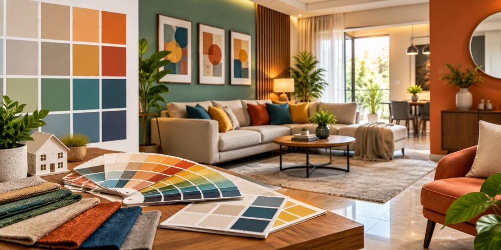
Choosing the right colours can completely change the way a home looks and feels. Colours influence the mood of a room, make spaces appear larger or warmer, and help create a sense of harmony throughout the house. Interior Designers in Chennai often consider natural light, room size, furniture, flooring, and the lifestyle of the family before selecting a colour palette. At Dream Kitchen Interior, colour choices are planned to create interiors that are both attractive and comfortable for everyday living.
Why Colour Matters in Home Interiors
Colour is one of the first things people notice when they enter a room. A soft neutral shade can make a space feel calm and spacious, while deeper colours can bring warmth and character. The right combination can also highlight architectural features, create visual balance, and connect different areas of the home.
You do not always need bold colours to make an interior interesting. Sometimes, a simple combination of two or three complementary shades can create a beautiful result. The key is understanding how different colours work with the existing elements of your home.
Choosing Colours for Different Rooms
Every room has a different purpose, so the colour scheme should match how the space is used.
Living Room
The living room is usually a shared space where family members relax and guests are welcomed. Warm whites, beige, soft grey, earthy tones, and muted greens can create a comfortable atmosphere. Accent walls, cushions, curtains, or artwork can introduce stronger colours without making the room feel overwhelming.
Bedroom
Bedrooms generally benefit from calming shades. Soft blue, sage green, cream, lavender, and warm neutral tones can create a relaxed visual environment. If you prefer darker shades, using them on one wall can add depth while keeping the rest of the room balanced.
Kitchen
The kitchen can handle brighter and fresher colours. White, green, grey, cream, wood tones, and subtle pastels work well with modern modular kitchen designs. Cabinet colours should also complement the countertop, backsplash, flooring, and lighting.
Dining Area
For dining spaces, warm earthy colours, muted orange, terracotta, beige, and wooden finishes can create a welcoming appearance. These shades can make the area feel more connected and inviting during family meals.
How Natural Light Affects Colours
The same colour can look completely different depending on the amount of natural and artificial light in a room. A shade that looks soft in a showroom may appear brighter under strong sunlight.
Rooms with plenty of natural light can accommodate slightly deeper tones, while darker rooms may benefit from lighter shades. Lighting temperature also matters. Warm lighting can make beige and cream tones appear warmer, whereas cooler lighting can change how whites, greys, and blues look.
This is why experienced Interior Designers in Chennai usually consider lighting before finalizing the colour palette.
Creating a Balanced Colour Palette
A good colour palette does not mean using the same shade everywhere. Instead, colours should work together naturally. A simple approach is to choose a primary colour, a secondary shade, and one accent colour.
For example:
- Primary colour: Warm white or light beige for walls
- Secondary colour: Natural wood or soft green for furniture
- Accent colour: Terracotta, mustard, or deep blue for selected décor
- Neutral elements: Curtains, flooring, and accessories that connect the palette
This approach keeps the interior visually interesting without making it feel crowded.
Colours for Small Homes
Colour selection becomes especially important in compact homes. Lighter shades can help reflect available light and create an open appearance. Using similar colours across connected spaces can also make the home feel more continuous.
Mirrors, glass elements, light-coloured furniture, and suitable lighting can further support this effect. However, small homes do not need to be completely white. A carefully selected accent wall or colourful furniture can add personality without making the room appear smaller.
Adding Personality Through Accent Colours
If you prefer neutral walls, accent colours are an easy way to express your personality. You can introduce colour through cushions, rugs, artwork, curtains, chairs, plants, or decorative pieces.
The advantage of using accents is that they can be changed more easily when your preferences change. This allows you to refresh the appearance of your home without redesigning the entire space.
Professional Colour Planning for Your Home
Selecting colours may seem simple, but coordinating them with furniture, lighting, flooring, ceiling design, and décor requires careful planning. Interior Designers in Chennai can help homeowners develop a colour scheme that suits both the property and their personal preferences.
At the heart of every well-designed home is a thoughtful balance between colours, materials, furniture, and lighting. Whether you prefer a modern, minimalist, traditional, or contemporary look, careful colour planning can make your home feel more personal and complete.
If you are planning your home interiors, start by understanding how you want each room to feel. The right colours can turn an ordinary space into a welcoming home that feels comfortable every day. With guidance from experienced Interior Designers in Chennai, you can create a colour palette that looks beautiful today and continues to feel right for years to come.
FAQs
1. What colours make a home look spacious?
Light shades such as white, cream, beige, and soft pastels can help reflect light and give rooms a more open appearance.
2. Which colours are suitable for bedrooms?
Soft blue, green, lavender, cream, beige, and other muted shades are commonly chosen for relaxing bedroom interiors.
3. Can dark colours be used in small rooms?
Yes. Dark colours can be used as accent walls or selected design elements to add depth without overwhelming the entire room.
4. How should I choose colours for my home?
Consider natural light, room size, furniture, flooring, personal preferences, and the overall style before finalizing your colours.
